Showcase
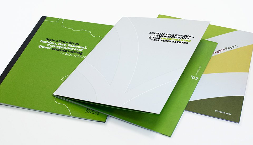
Annual reports don’t have to be dull.
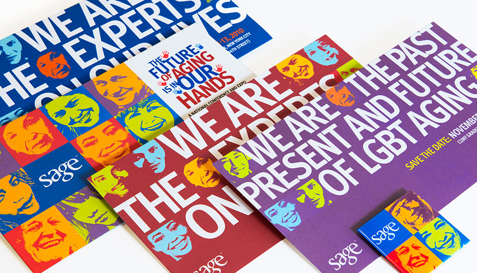
SERVICES & ADVOCACY FOR GLBT ELDERS (SAGE)
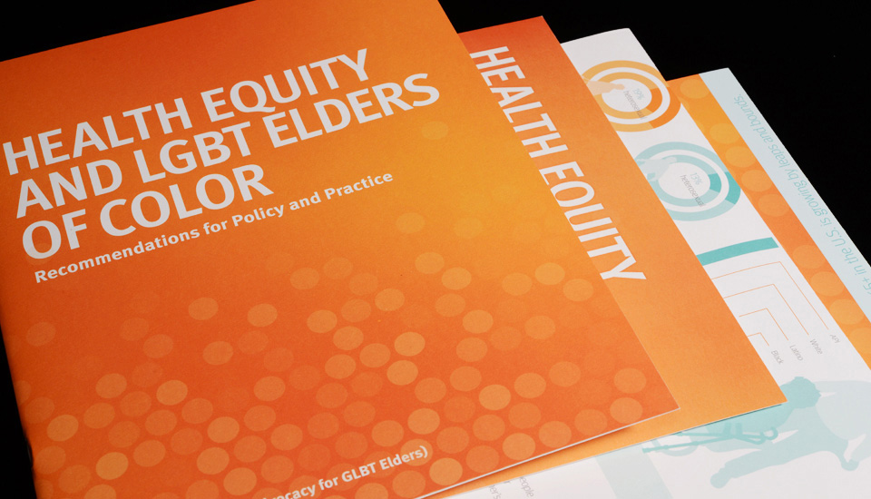
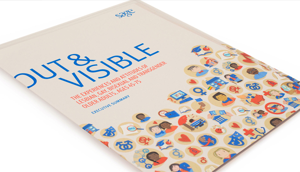
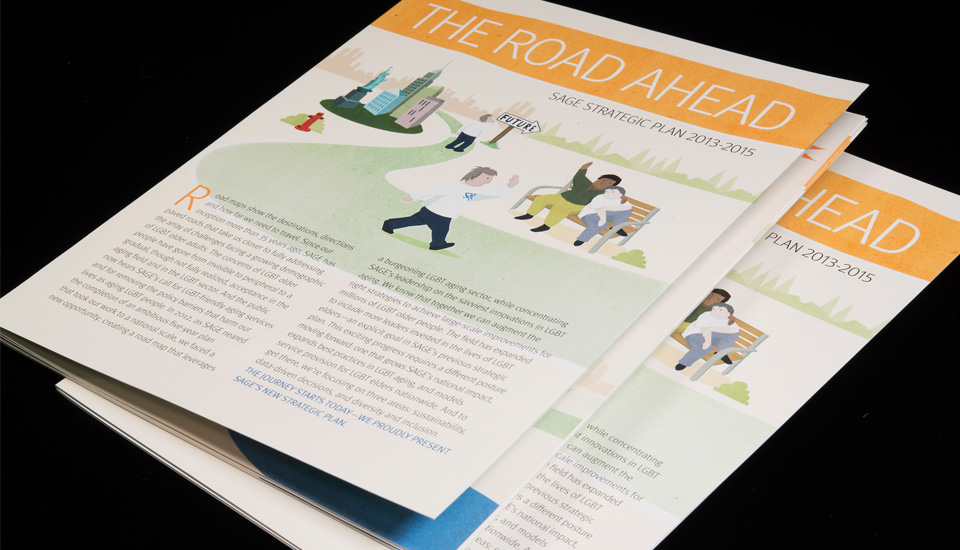
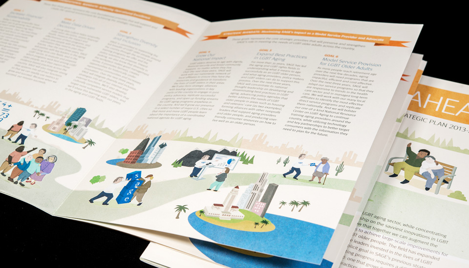
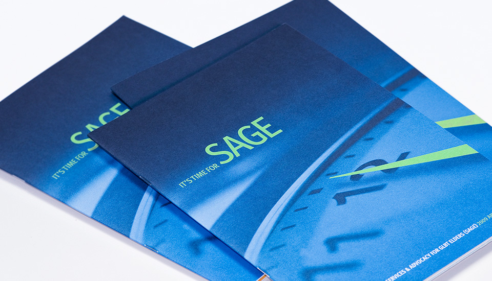
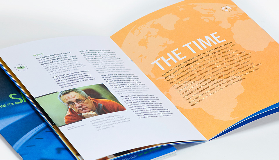
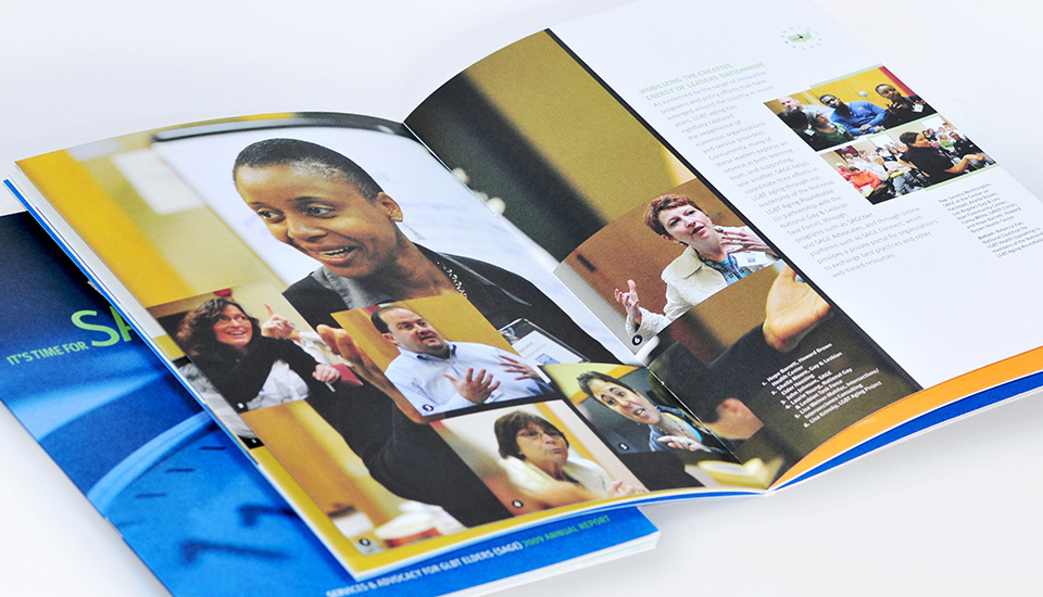
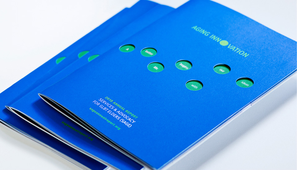
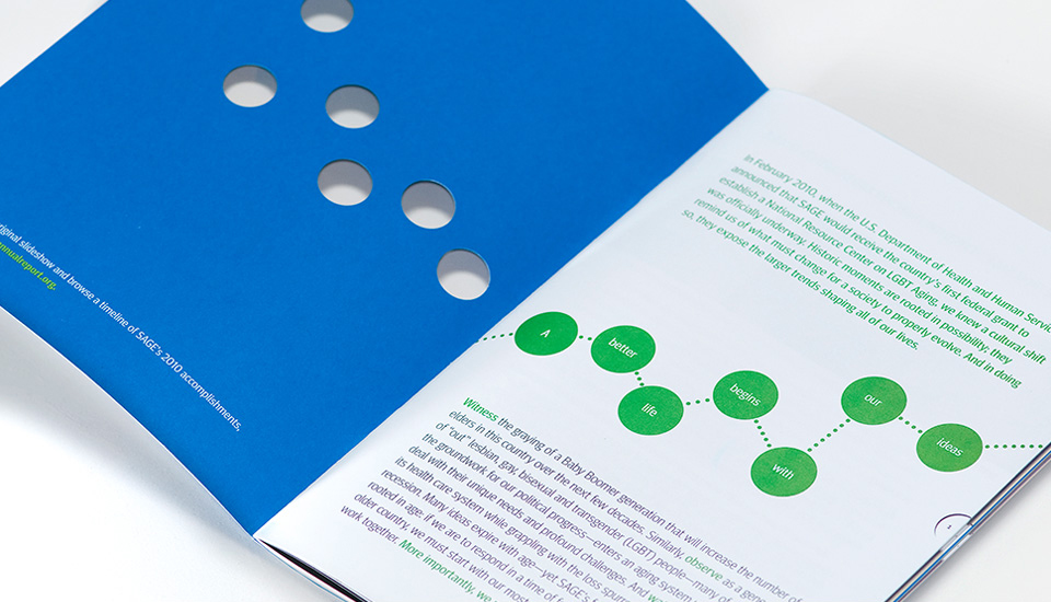
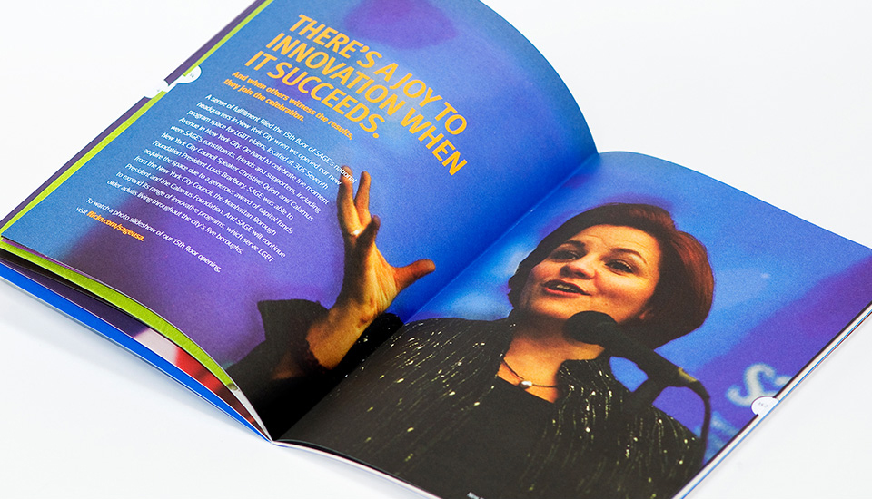
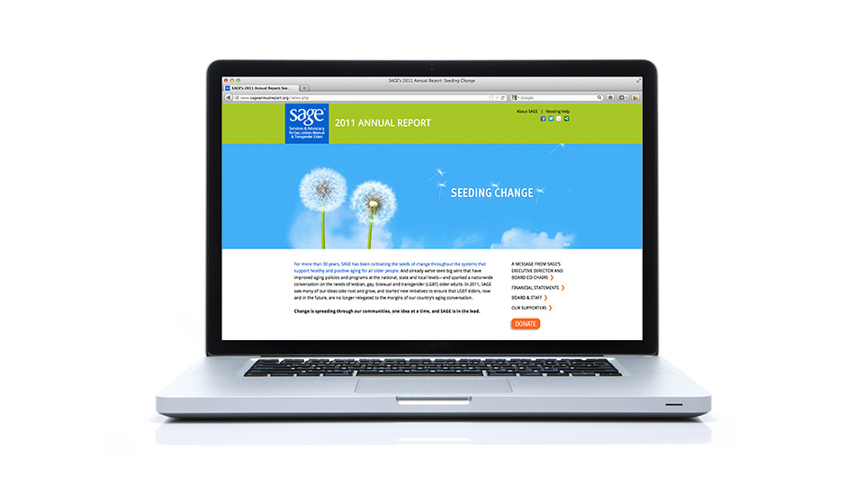
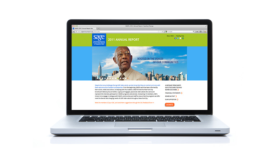
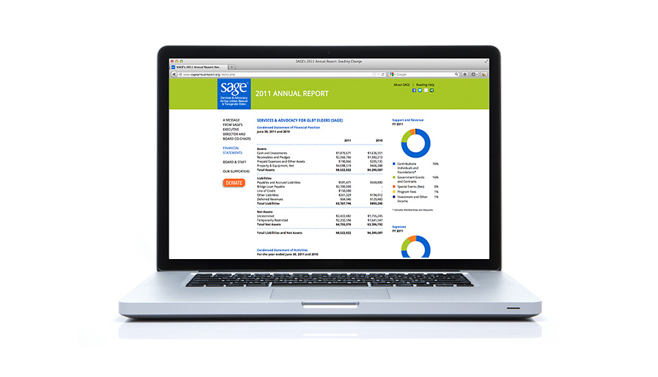
Too many annual reports are dull, drab, “corporate-speak” affairs. Our approach to such documents is to break up the monotony by fresh, innovative, human-sized design. Case in point is our work for SAGE. One of our first projects for this client was a total re-design of their 2009 Annual Report. Themed “Itʼs Time for Sage,” we spruced it up with new graphics, enlivening the text with full spread photos, setting the type larger (itʼs read by elderly people), and further humanizing the SAGE message. We have designed every subsequent SAGE Annual Report since, including accompanying microsites and direct mail. For the 2012 SAGE Strategic Report, we commissioned a French illustrators, Delphine Deparis and Elodie de Lardemelle from Delo Studio to provide a light hearted lift to a data-heavy report. These examples from SAGE illustrate our sometimes unconventional – but always interesting and engaging – approach to material that too often suffers from a dearth of imagination.
